Is my online store really doing UX right? Or do they just tell me it is?
The cost of store owners’ decisions when it comes to UX, and a few tips on what to look out for.

Bob scrolls down his Facebook feed on his mobile. He’s been doing that for the past 15 seconds (he’s waiting for his meal to cook).
Facebook, after 23 posts, shows an ad to my store. The algorithm worked. Bob is actually interested, since he has wanted to buy a new laptop case for a while, and clicks on the ad.
He ends up on my store, in the advertised category (Laptop Cases).
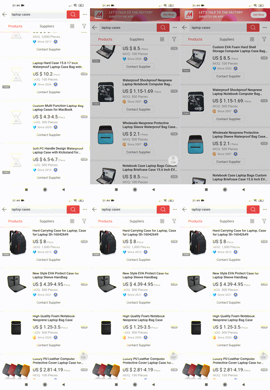
Scrolls down, but there’s a lot of products, so it’s quite a bit of scrolling.
Me: The theme I’m using has infinite scrolling, it’s better for mobile devices.
However, Bob has a small issue. When new products are loaded, the last product he sees gets out of vision. There’s a sudden shift, so he has to scroll up a bit again to make sure products were not skipped.
On which product am I?
Nevermind, it doesn’t even cross his mind, other than a small subconscious annoyance. His brain is used to that kind of experience on the Internet by now.
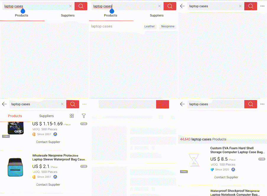
Since there seems to be a lot of products, he decides to use the search feature. Clicking on the search input opens a fullscreen search component.
Me: I have installed a highly reviewed app that auto suggests results. It costs a bit but it has increased conversions.
He wants to search for “hard laptop cases” so he decides to clear and retype the query (right now it’s “laptop cases”). That’s because he instinctively knows he’s going to have a harder time with clicking the input right behind the first word.
Unfortunately, the “x” (clear) button is too close to the big red search button, and since the screen is small, he accidentally resubmits the query.
Now the same page has to load again.
Accidental click on Submit
Nevermind, it’s not as if he’s going to leave the site because of that.
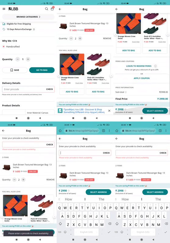
Eventually, he finds the product he likes, and clicks on the “Add to cart” button. Opens the cart, clicks on “Checkout”, and ends up in a page with an unfamiliar layout.
I have installed several useful checkout apps, like a related products app that shows suggestions.
Where do I put my money?
Bob has to scroll way down to find a button that says “Select address”, that gets him all the way back up to an input that was already there. He didn’t realize he had to fill it in.
The result?
He actually completed the checkout and paid for the product.
Yes, he really liked that case.
The problem
Today, everyone talks about UX and its importance. However, people have below average experiences like Bob all the time.
To help us get a better understanding of the problem, we can categorize causes for bad UX on our site to:
- Conscious decisions that benefit short term conversions and budget, at the cost of overall user experience.
- Problems that the store owner, designer, or developer are completely unaware of, or didn’t find the need to fix.
Let’s look at them separately.
1. The balance between conversions and UX
It’s no news that a store’s main purpose is to maximize conversions, and that sometimes it comes at the cost of user experience.
This is understandable. If adding a popup annoys some people, but leads to more sales, then the business will keep it. Besides, budget for extended UX research and testing is rarely available to smaller stores.
What’s important here is to be aware of the long term effect of these decisions.
As a store owner, you need to balance the short term profit, with the overall relationship you create with your customers.
A customer-centric business wants the visitor of the store to have the best possible experience. Everyone has tasks that they dread going through, and flows that are smooth and enjoyable. When a happy user leaves the store, the impression stays in their mind. If you do UX really well, it could even be one of your Unique Selling Propositions.
And yes, dark practices can be beneficial to sales, but you need to be fully aware of the cost.
2. Detecting 90% of UX problems is a matter of minutes
To meet the store’s needs in features, we install a number of apps or plugins, and a theme.
Sometimes, these components add the features they are supposed to, but in its entirety, the result might be very undesirable in terms of user experience. And we don’t even notice it ourselves.
Notice how well-designed websites are attractive and somehow make you want to go back. And how there’s websites that are a drag to use, make you click on things way more times than needed, are confusing or completely unfamiliar.
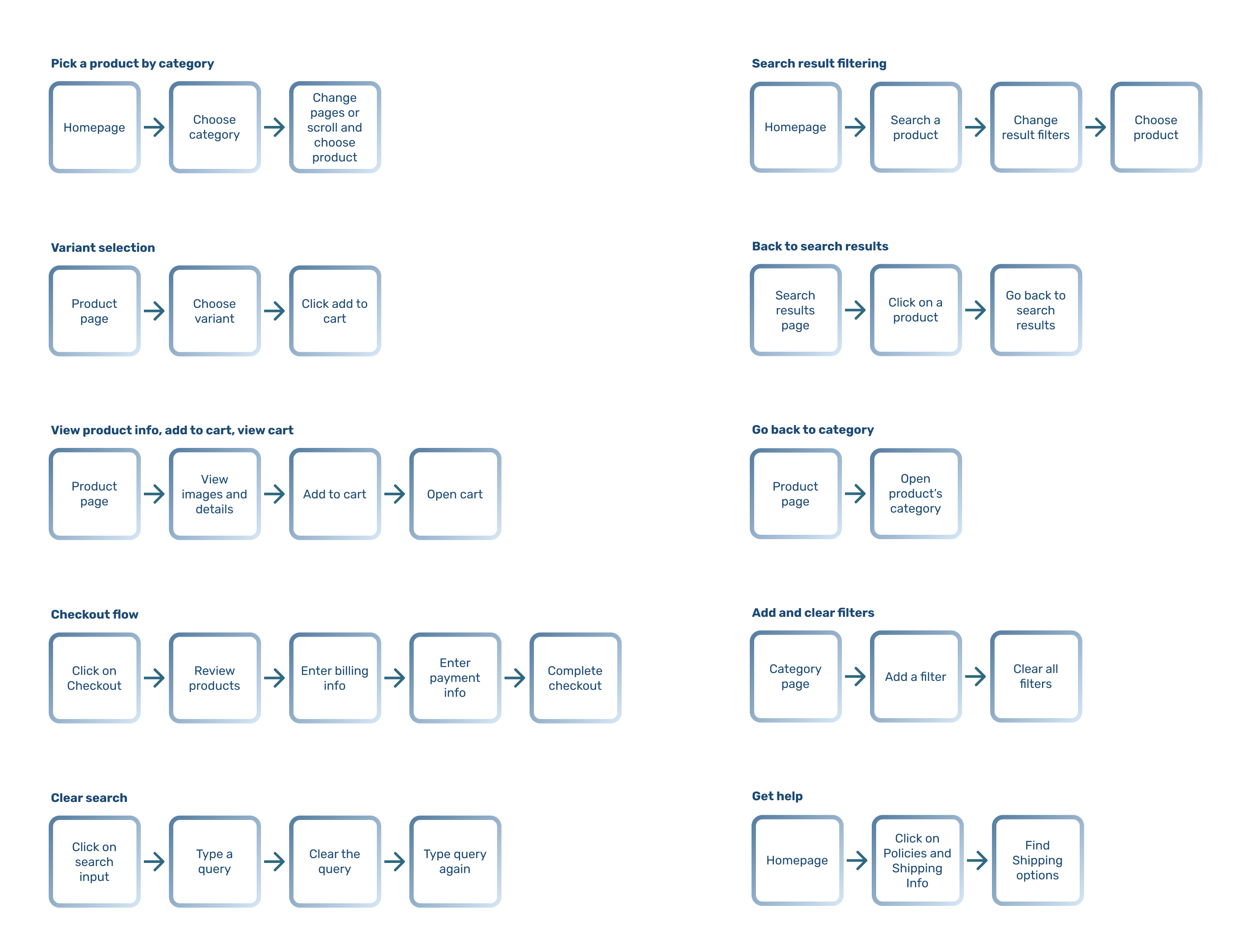
Some user flows to test
To pinpoint the majority of these issues, if you can’t afford complete UX research or testing, do the testing yourself.
Try to be thorough when inspecting the site. Make sure everything works with no hassle. Pretend you’re a customer, and want to go through basic flows. And then, have other people do it while you observe their actions. People whose characteristics approximate your average customer.
Here’s some examples of flows to go through:
You’ll find plenty of valuable information about this on the Internet, but here’s some points to look out for:
- Is there a direct and unobstructed path between each stage? Is the user put through extra steps (clicks) to purchase, that can be omitted?
- Are the most important parts of a page emphasized and easy to reach (info, buttons)? Are secondary elements less emphasized and out of the user’s way?
- Do the elements of a screen get quickly repositioned when the page loads, resulting in confusion and false clicks?
- Is scrolling working correctly, instead of breaking the experience (lists, menus, popups)?
- Are buttons easy to accurately touch on a small mobile screen?
- Are errors in forms visible and easy to understand, or is the user left to wonder what happened?
- Is there a visible confirmation after a successful action, or is the user left wondering if the action worked?
- Are there any really slow processes, where the user isn’t informed that they have to wait?
- If the user puts down the phone and picks it up, can they easily tell on which stage they were?
- Is it obvious that an item is clickable, or does it seem like just another text or image?
- Are popups and alerts easy to close, or does the user have to look for the close button and struggle to click on it?
- Can the user go back at any point without stuff breaking or having to fill forms again?
Lastly, do all this manual testing from a mobile device first, and then the desktop. Of course, this depends on your Analytics data, which can give you a percentage of mobile, desktop and tablet visitors.
Conclusion
Most online stores are developed with a lot of attention to details. They're the front of the business, and the main point of contact with the customer.
But sometimes, we need to pay some extra attention to notice what's right under our nose, but nobody showed us. And see UX for what it really is. Not just a list of “user-friendly apps”, but a mindset of empathy towards the user, and constant research.
Thanks for reading!


